Creating and establishing a brand identity is essential to creating a memorable brand. And a lot of pressure.
A brand identity comes together with a logo design, business cards, messaging, and colors tell the story of a business. The story it creates must resonate with your audience and help differentiate the brand from the competition.
It all begins with a font.
A font is more than just a typeface. It’s a reflection of a brand and the values held by the company — traditional, edgy, quirky, or formal. Choosing the right font can help to attract the right customers and audience.
It’s also important as the best font for the brand may also be the best font for the call to action used to capture the audience’s attention.
Whether you’re looking to give the brand an updated look, giving the brand a complete overhaul, or redoing the website, it’s important to start the project on the right track.
Before enlisting a designer to create business cards or imagery to be used online, learn how to choose a font for your brand.
Brand Identity
Each company has a brand, and that brand creates an identity. A well-defined personality is what your audience connects with and how they will remember the company. The well-defined branding and personality can help to increase brand awareness.
Business owners who do not currently have a well-defined brand should take the time to determine how the brand should be perceived before picking out a font.
This can be easier said than done, but not impossible. To get the ball rolling, ask the staff to pick four adjectives they would use to describe the brand.
Polished, custom, innovative, versatile, and reliable are just a few of the adjectives that could be used to help form a well-defined identity. Then, with the identity in mind, you can move forward to determine which font is best suited to the brand.
Understanding Font Categories
Unless you have a love for typography, font categories are probably unfamiliar territory. But once you have a well-defined brand, this is the perfect place to begin the search for the perfect font for the brand.
Font categories are classifications used to help graphic designers identify, choose, and pair fonts. Each category has a unique trait, differentiating it from the next. Understanding the traits of each category is essential.
The six basic font classifications are:
- Serif
- Sans-Serif
- Slab Serif
- Script
- Handwritten
- Decorative
Within these categories are fonts, each unique in its own way.
Serif Fonts
Serif fonts are named for the feet — known as serifs, at the top and bottom of each letter. This font is typically viewed as classic or traditional.

Serif fonts are typically used by brands that want to convey a sense of respectability and tradition, like Time Magazine. Popular serif fonts include Times New Roman, EB Garamond, Merriweather, and Playfair Display, among others.
Sans-Serif Fonts
Sans-serif fonts emerged around the 19th century and are a simpler form of serif fonts. Creating a minimal design, sans-serif fonts tend to evoke a sense of cleanliness.
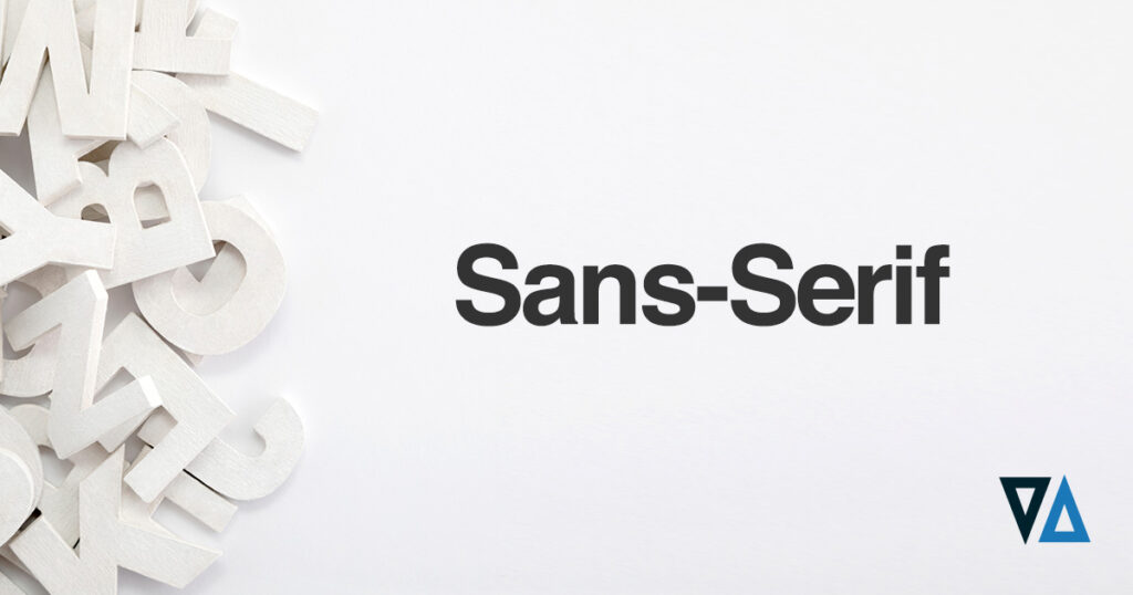
Sans-serif fonts are quite common on the web and are often associated with brands like Spotify. Common sans-serif fonts include Helvetica, Open Sans, and Arial, among others.
Slab Serif Fonts
Much like the name would imply, slab serifs tend to have a bulkier, block-style appearance. As a result, slab serifs can look more rugged or bold compared to traditional serif fonts.
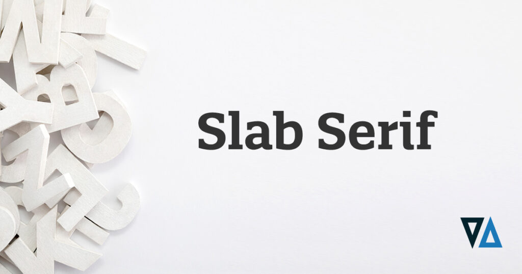
This font is typically used by companies with a long history and has become synonymous with dependability and quality workmanship, like Volvo.
Popular slab serif fonts include Rockwell, Arvo, and Courier New, among others.
Script Fonts
Script fonts tend to imitate cursive writing, with strokes that connect one letter to the next. It will evoke a feeling of classic, elegance. And much like cursive writing, each script font is slightly different from the next.
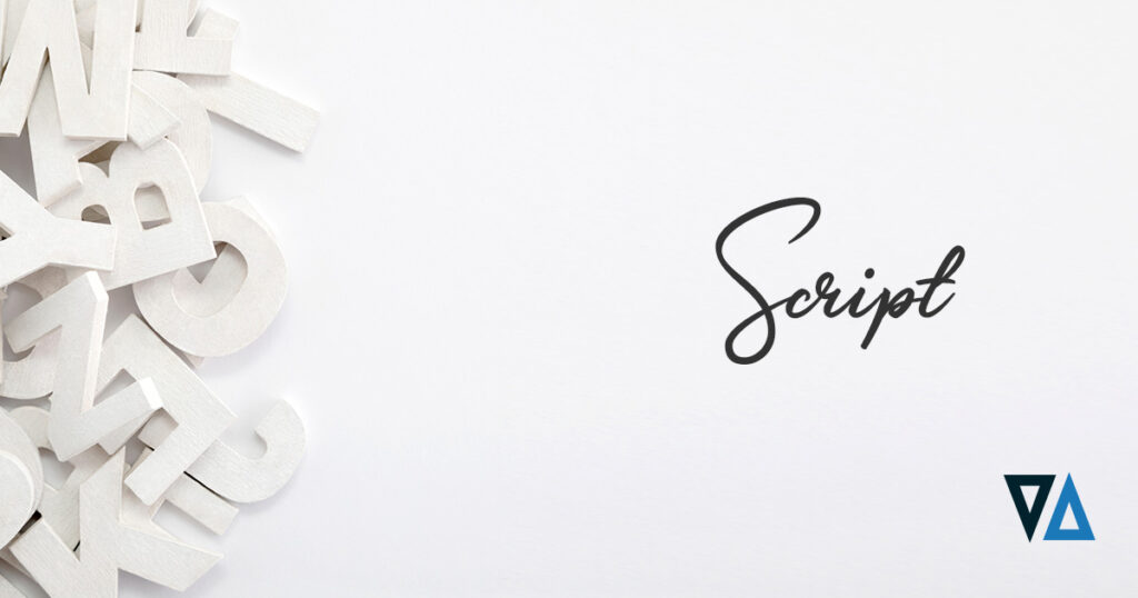
For example, Instagram and Cadillac use script fonts for their brands, but there are differences between the two.
Script fonts include Satisfy, Lucida Script, Allura, and many others.
Handwritten Fonts
Much like the name would suggest, handwritten fonts look like just that — to have been written by hand.
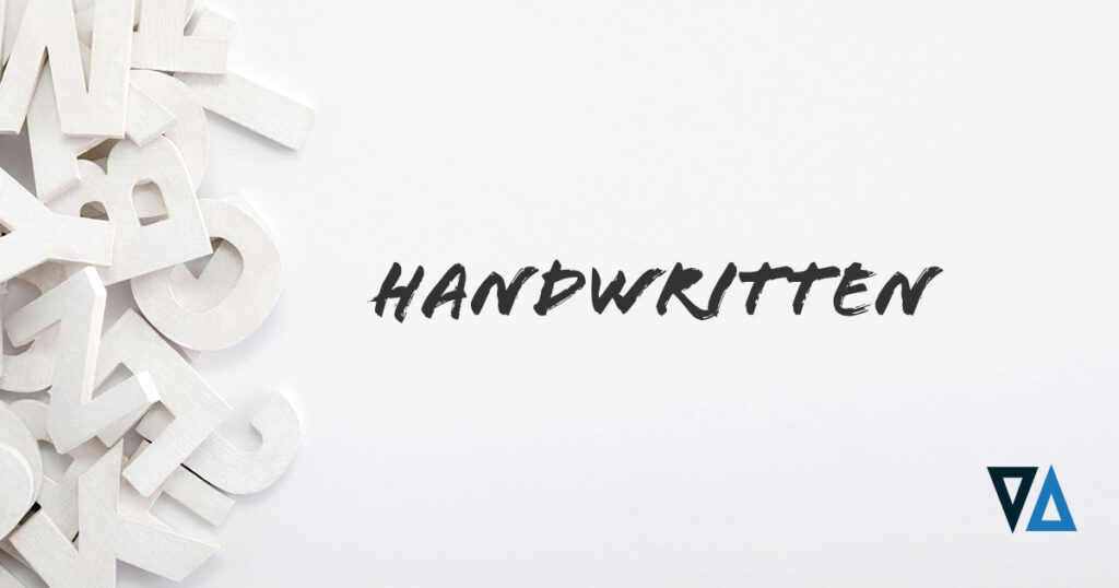
This type of font is almost the total opposite of traditional serif fonts. Handwritten fonts can be a fun choice to make a brand look approachable, fun, or playful.
Google fonts offer an array of handwritten fonts, including Patrick Hand, Permanent Marker, and many others.
Decorative Fonts
Decorative fonts are diverse and the epitome of creativity. It can include shapes, forms, or a highly stylized approach.
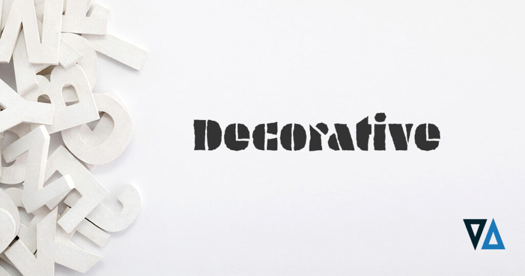
Brands like Lego feature a decorative font that would be recognized by almost anyone. A decorative font is best in small doses. Fonts in this category include Fredericka, Lobster Two, and many others.
Choose a Font That Matches the Brand Personality
Now that the brand personality has been determined and you have an understanding of fonts – because there’s more to it than just what looks good, it’s time to choose a font for your brand.
Within the font categories are style variations that can have an impact on the final design and overall appearance of the brand name.
Pairing a bold serif header with a minimalist sub-header creates an accessible, trusting outwards appearance.
There is also the option to pair a bold version of a font with the minimal version. By doing so, a sleek, modern logo can be created.
Brands that want a modern, upscale look would do well with a thin, stylized sans-serif font. According to font psychology researcher, Sarah Hyndman, lighter-weight fonts create an expensive appearance as opposed to heavier, or rounder fonts.
Hyndman came to this conclusion after surveying nearly 400 people.
Her findings should come as no surprise when we look at the fonts and stylizations of the likes of Aston Martin and other luxury brands.
This is in contrast to brands like Google, which uses a youthful or playful font.
Get Help in Choosing a Font for Your Brand
Whether you decide a handwritten font is ideal for the brand or if you need help picking a font to bring the brand to life, it’s important to ensure that the font is legible. This helps to ensure consumers will have an easier time reading the name and then recognizing it at a glance.
Working with a seasoned professional can ensure the ideal font — and stylization, has been chosen. By doing so, you will know that it will match the brand personality and translate well across multiple formats — including billboards, business cards, and in digital marketing.
Contact the creative team at Elevation Ten Thousand to help you choose the right font for your brand and create a memorable logo that translates across multiple mediums.